12 Famous Logos That Hide Secrets We Are About to Uncover
A logo is the first thing anyone sees when they look at a certain brand or company. That logo sends a very specific message of who the company is and what it has to offer its customers. It can evoke many emotions based on the colors used and the design that was chosen. And sometimes they hide secret messages and symbols that only if you look super closely you will recognize.
1. Toblerone
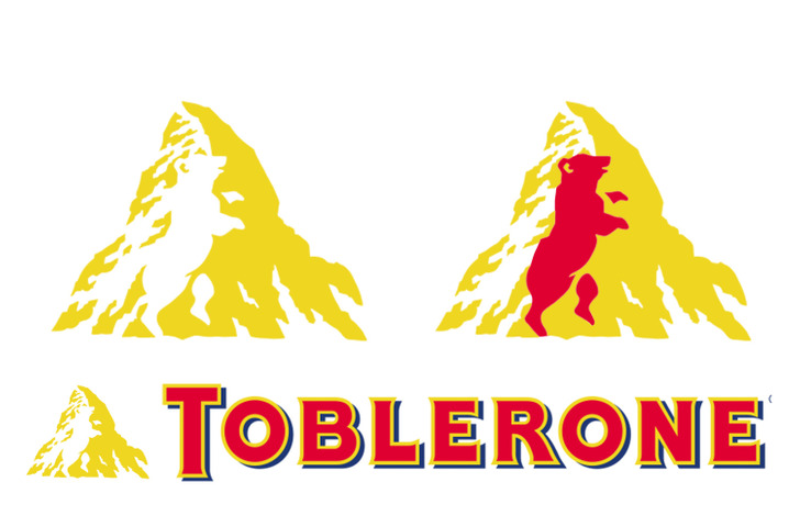
Toblerone, the famous chocolate company based in Bern, Switzerland, includes a silhouette of a bear in its logo, on account of the fact that Bern is sometimes called a city of bears. The beginnings of the company trace back to 1868, when Jean Tobler, who was a Swiss chocolatier opened a shop and subsequently a chocolate factory.
When it was Theodor’s, his son, turn to run the business, he started experimenting to create something new that the world hadn’t taste yet. And that’s how he came up with the distinct flavor of the candy.
2. Airbnb
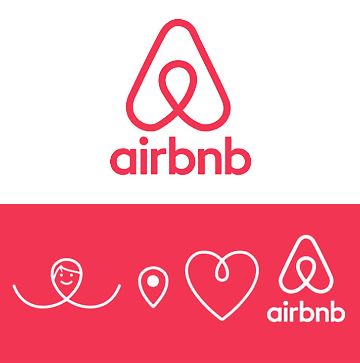
The internet service Airbnb, that people use to find places to stay all around the world, chose a really strange logo that looks like a paper clip. But in fact, the logo has a much deeper meaning than it might seem at first glance. It contains 4 elements: the head of a person that represents a user of their site; the sign for a location on a map — for the place where the house or apartment is; a heart — the sign of love; and all these symbols are combined to make the letter A for Airbnb.
3. TripAdvisor
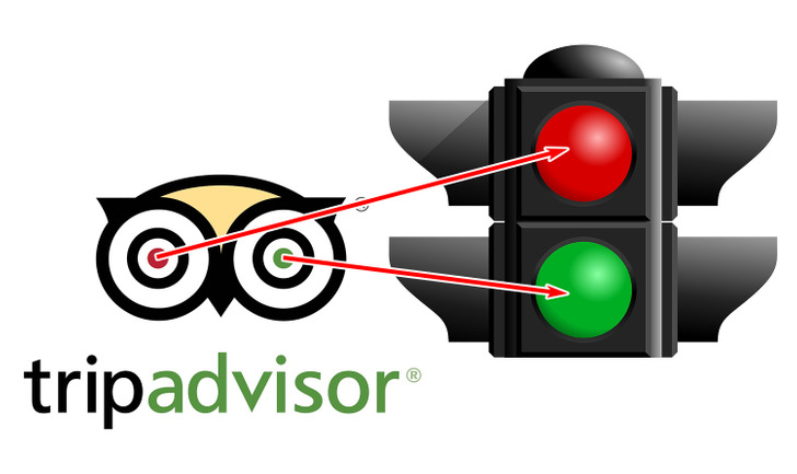
The American website TripAdvisor allows travelers from all around the world to choose the best hotel to stay at, the best restaurant to go to, the best airline to use, and even the most interesting place to visit. On the website, there are a lot of reviews from other users which you can use to help you make your decision. The logo of TripAdvisor looks like an owl which symbolizes wisdom and knowledge, and its eyes symbolize the choice that a traveler will make: green light — they should go, red light — definitely not.
4. Pinterest
Pinterest is a social media site that was created by Ben Silbermann, Paul Sciarra and Evan Sharp in 2009. Pinterest became widely popular specially in 2014 and the users were mostly women. The idea for the site arouse from an earlier website created by Ben and Paul which was supposed to replace paper catalogs.
Recently Pinterest created the creator fund after realizing that content creators can help bring traffic to the platform. The fund is a program in which creators can earned money, in order to be incentivized to keep creating the content.
5. MasterCard
MasterCard, the international payment system, decided to use color psychology in its logo. The red color stands for bravery, passion, and for actions that make you feel joy. The bright yellow color symbolizes prosperity. MasterCard thinks that these qualities are necessary for people who want to become rich, so the colors in the logo meet in the middle.
6. Mazda
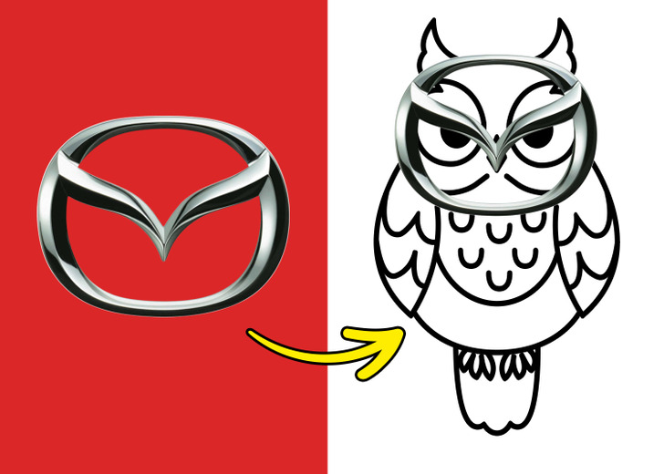
When you first see the logo of car manufacturer, Mazda, what you notice is the letter “M” being formed in the middle of it. That clearly stands for the company’s name and it looks like wings that want to fly the company into the future. And if you pay closer attention, you might even notice an owl’s face, since the logo has the exact same formation at the animal’s facial structure.
7. Vodafone
British mobile operator Vodafone chose a couple of mysterious things for its logo that remind many people of an earpiece, but it’s actually just a quotation mark. So, in this case, an open quote stands for the beginning of a conversation. The designers wanted to show that, with Vodafone, users can talk to each other anytime.
8. Tesla
Tesla Motors was founded in July 2004 by engineers Martin Eberhard and Marc Tarpenning. The name of the company is a tribute to the Serbian inventor Nikola Tesla.
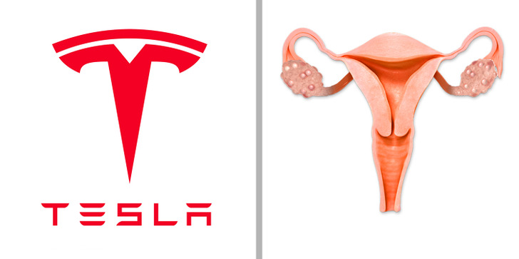
On social media, you can find several different opinions about the origin of the company’s logo. Some users believe that it was the female reproductive system that inspired the designers. And other people think that the logo is a cat nose, that even Elon Musk confirmed (jokingly) on Twitter.
But in fact, the logo shows a section of an electric engine that was invented by Nikola Tesla in 1883.
9. Mozilla Firefox
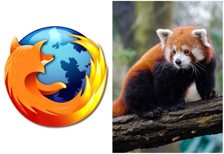
The famous web browser Mozilla Firefox put a fox on its logo that circles the entire planet. But what if we told you that this is not a fox but a red panda. The thing is, “firefox” is the English translation of the Chinese name for a red panda. This way, the company wanted to demonstrate how unique they are because this is a very rare kind of panda that is endangered. And in 2010, Mozilla Firefox even adopted 2 red pandas and took responsibility for their lives.
10. Quicksilver
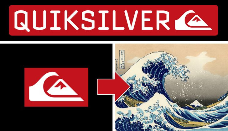
In 1973, the founders of the company Quiksilver, Alan Green and John Law, were inspired by Japanese painter Hokusai’s woodcut, The Great Wave off Kanagawa, when creating their logo.
11. Orbit
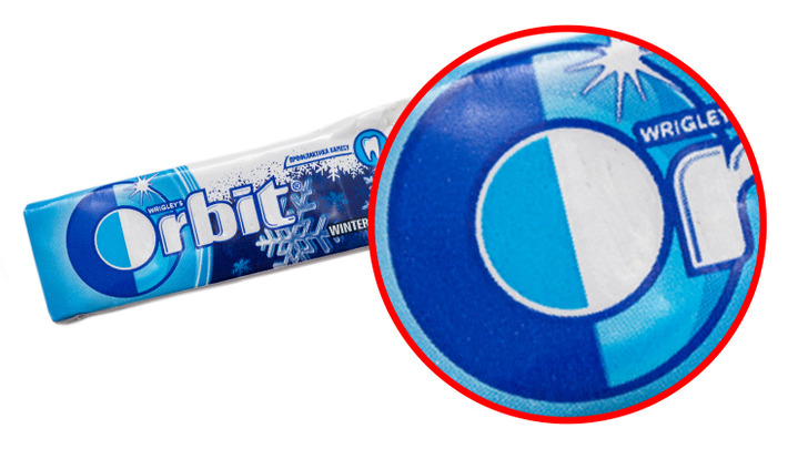
If you look closely at the logo on an Orbit pack, you will notice that the capital “O” is split into 2 parts: one dark and one light, and in the background you can see the image of an orbit. So, it’s clear that the “O” symbolizes day and night and a planet revolving around the Sun.
12. Facebook
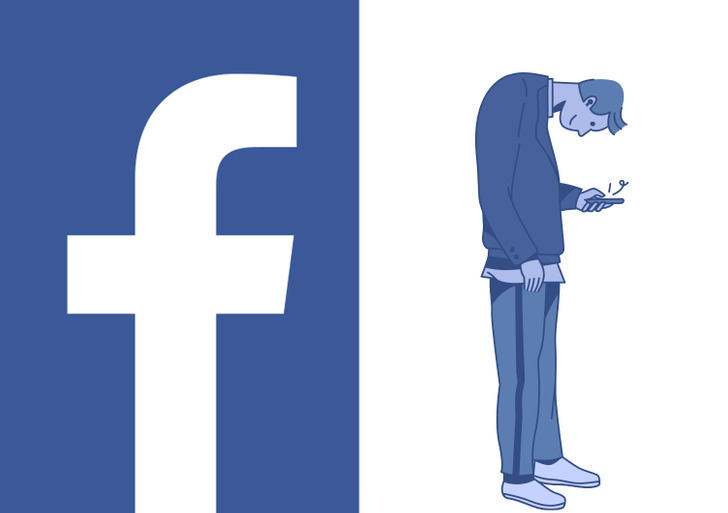
Facebook is one of the biggest companies on the planet and it can be recognized by anyone by its simple logo, which is the lowercase letter “f”. And while this is quite simple and without any hidden messages, it’s like that little letter predicted the future of phone use. The way people get lost into their phones nowadays, that letter “f” could easily be interpreted as a human being slouched over their phone.
Why do you think company owners insert little secrets inside their logos? Is it because they want their logo to be unique or because they want to send subtle messages?
