16 Makeovers That Went So Wrong They’re Actually Hilarious


Centuries after their creation, experts continue to analyze the work of master artists — but it’s impossible to say with certainty what was intentional and what was accidental. All we can do is enjoy these masterpieces, noticing what might be called “flaws”: the asymmetrical feet in Botticelli’s paintings or Géricault’s horses seemingly floating in midair.
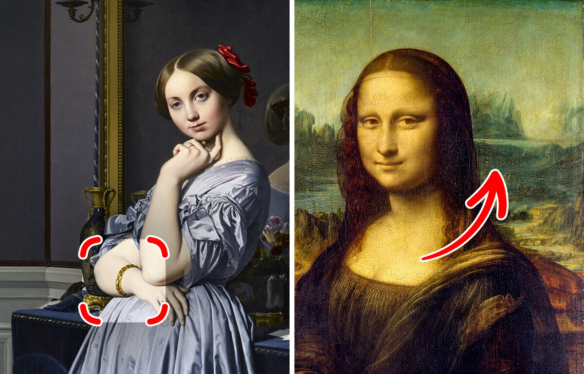
Ingres never let anatomy constrain the fluidity of his portraits. At first glance, Comtesse d’Haussonville exudes hyperrealistic precision — so much so that viewers are often astonished it was painted by hand. But a closer look reveals impossibilities. Most striking is her right arm, which crosses her waist at an impossibly low angle, seemingly emerging from the middle of her body rather than connecting to her shoulder.
Additionally, the fingers of the hand the model holds to her neck are visible in the mirror — though, logically, they should not be reflected there.
Diego Velázquez was a true perfectionist, and it’s hard to believe that there can be even a tiny mistake in his paintings. But the artist was let down by his style of painting. María Álvarez Garcillán of the Prado Museum says that Velázquez worked very quickly to depict people in natural poses. Then he scrutinized the painting and corrected the faults.
For example, in the painting “The Maids of Honour,” he didn’t like the position of one character’s leg. He quickly repainted it. But over time, the top layers of paint thinned, and a strange shadow appeared on the canvas, showing the original position of the leg.
In his painting, the artist was able to depict flowers and insects in a surprisingly naturalistic way. But the poor kitty came out a bit frightening. Art historian Rachel Gould generally believes that the animal has bat ears, a human nose and a mouth that looks more like one of a monkey.
Perhaps Mignon was a dog person at heart and didn’t like cats. Either way, the combination of gorgeous colors and an ugly cat is stunning.
Not everyone would immediately understand that Manet painted this painting, as it is very different in style from his later works. The artist decided to depict himself and his bride in period costumes against a pastoral landscape. But, as art historian Rachel Gould rightly points out, Manet possibly lost interest in the painting midway through the work.
The figures of people and the plants in the foreground are carefully painted, but the meadow behind the pond seems flat and inexpressive. And the rainbow looks like some dull and gray arch. Perhaps Manet deliberately left the painting unfinished or simply abandoned it at some point to start another canvas.
Art historians never stop arguing about why the right hand of one of the characters in Caravaggio’s painting is so gigantic. Some believe that the artist was trying to show movement in this way. But researcher Susan Grundy suspects that this is a mistake: the maestro used the camera obscura incorrectly while working on the canvas.
In any case, as soon as you notice this detail, your eyes keep trying to return to it. And the basket with fruit also needs some adjustments so that it doesn’t fall off the table. According to the artist Trace Bradley, Caravaggio painted these utensils this way for a reason — he wanted to make the viewer look at the painting more attentively.
In the painting The 1821 Derby at Epsom (or The Epsom Races), the horses’ legs are depicted incorrectly: their front and hind legs stretch in opposite directions, giving the impression that the animals are hovering rather than running. This error was revealed 50 years later by photographer Edward Muybridge. While horses do lift all four legs off the ground for a split second, their anatomy makes the motion appear differently.
Manet may not have realized that one of his most famous paintings would torment art historians for years, but that’s exactly what happened. More than 140 years have passed since the painting was created, and, according to Master of Arts Philip McCourt, researchers can’t agree on why the artist made a mistake in drawing the reflection in the mirror.
After all, you can see with the naked eye that the barmaid there is a little fuller, and her hair is sloppier. You also can’t see the client she is talking to. Manet’s contemporaries even teased the artist, pointing out these oversights. However, modern researchers believe that in the wrong reflection laid a deep meaning. We just need to find it out.
Sandro Botticelli was undoubtedly a great painter, but there was one detail he couldn’t get right. Although perhaps the artist didn’t try too hard. Every time Botticelli depicted his characters in full height, their feet looked, to put it mildly, unnatural.
Artist and painting teacher Ruthie V. notes that the artist even managed to add extra phalanges to the toes of the models. Well, this is an excuse to enjoy the beautiful faces of Venus and Spring even more, without being distracted by other details.
The portrait of an elderly man, painted with careless, rough strokes, caused much controversy among art historians. Some researchers were sure that the painting was not painted by Rembrandt but by one of his imitators. For example, the columnist Huntley Dent writes that the painting looks very careless: the man’s hands are different in size, and the old man’s beard looks like tangled sheep’s wool.
However, experts of the National Gallery insist that the portrait really belongs to the brush of the great artist. In that period, he was experimenting with techniques and colors. Rembrandt had no idea what a storm his experiments would cause a few centuries later.
Vuillard often used an unusual technique. Working on scenes from everyday life, he carefully drew the interior, but he depicted the figures of people deliberately simplified. However, in this painting, he slightly overdid it: the canvas turned out to be so overloaded with details, and there are so many colors that can make your eyes go blurry. According to art historian Rachel Gould, Vuillard clearly overdid it.
At first glance, there is nothing wrong with Raphael’s great painting. But attentive viewers have long noticed that there is something wrong with the man’s left hand. It seems that the artist accidentally or deliberately added another finger to him.
Some art connoisseurs even managed to build a whole theory on this small detail. However, art historian Andrey Zimoglyadov notes that the extra finger is just a piece of the palm, and there is nothing unnatural in the hand of St. Sixtus. It’s just a bad angle.
While the world focuses on the delicate symmetry of the Mona Lisa’s face and scholars dissect the mystery behind her smile, the background often goes unnoticed. A closer look reveals that the left and right sides of the landscape seem almost disconnected. Some suggest this was a deliberate result of Leonardo’s artistic experimentation.
Before you go, don’t miss our other article revealing hidden details in famous paintings that tell a deeper story.


