Even though manufacturers don’t always realize this, their clients almost always pay attention to the details. However, nuances like a raised edge on a ruler for picking it up easily or body butter packaging with a removable top, allow people to use products more efficiently and also feel appreciated.
We at Now I’ve Seen Everything are happy to share these 12 thoughtful designs.
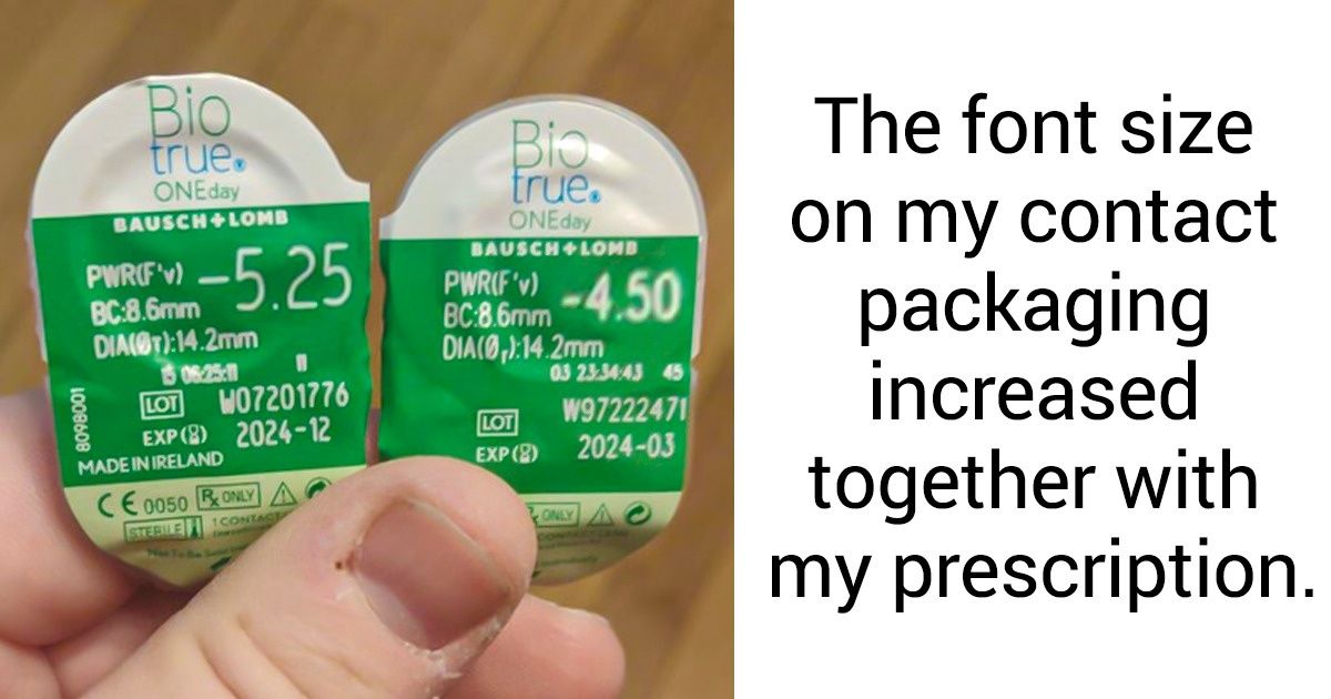
“The font size on my contact packaging increased with my prescription.”
“This desk I am building has the parts for each step individually packaged.”
“My protein powder scoop is designed to sit on a lip just under the lid... so you don’t have to reach into the powder to grab it.”
This pizza lets you remove the instructions so you can throw the packaging away.
“Had to buy a new mouse and this was the packaging. It had places to wedge your fingers in and was perforated. Took 10 seconds to open without scissors.”
“Ruler has a raised edge so it’s easier to pick up.”
The plastic packaging for this paint roller is a paint tray.
“My ‘frikandel’ package has a ruler on it so you can see how long it is.”
“This napkin in Italy comes folded in a way so you can stuff it with silverware.”
“Never seen Braille on packaging before.”
This packaging has a ruler so you can cut ingredients accordingly.
Gauge indicating how your fragile package has been handled in shipping.
Have you ever come across examples of exceptional customer care? Which company has pleased you the most with their thoughtfulness?
