18 People Whose Worst Days Made Us Cherish Our Bad Ones

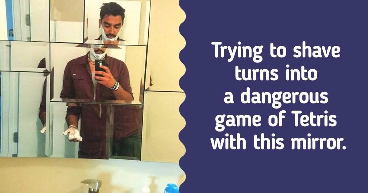
Even the brightest ideas don’t always turn out the way we want them to. With that, sometimes it can be hard to understand what the designer wanted to do in the first place; this is how we get doors to nowhere in the middle of a hallway, sprinklers right underneath a park bench, and mirrors that split your reflection into many pieces.
We at Now I’ve Seen Everything present you with a collection of design ideas that probably wouldn’t go down in history as the best ones.
This is one of those design fails that could’ve been so easily avoided, and yet, we got that. Not that we’re complaining. If we saw this on the street it would for sure make our day.
Not only is this a weird design, but it can also be extremely painful. Each and every one of us must’ve slammed their fingers on the door or even the door handle, and this failed design makes sure that it’ll happen every single time.
This could be one of the funniest design fails we’ve ever seen. We do sympathize with the baby, but in situations like this, what can you do but laugh.
We live in the future now and these glasses are the best and only proof we need. Thank you, hilarious design fails, not only do you make us laugh, but you also can be used as a great conversation starter at a party!
Now, is this a bad design or an encouraging one? Whether we can call it a fail or not, at least it keeps the space more open.
This might be taking the crown of the hilarious design fails. How does this thing look like a lion and a bear all the same time?
Not weird, mysterious! Imagine, you’re going up the stairs and suddenly there’s a door where there shouldn’t have been one, so mystical. But seriously, is this a failed design? Yes. Is this kinda funny? Also yes.
Do you think the designer is the only one to blame when a product is non-functional? Do you prefer functionality or aesthetics when it comes to choosing objects?
