The packaging or the design of a product is the first thing we see, and it could help influence our decision if we’ll purchase the item or not. This is why some consumers can’t help but feel disappointed when the labels don’t exactly deliver their promises. Just like these objects that were like Trojan horses — presenting a shiny façade but hiding a different reality inside.
1. “I chose the bottle because a tube wasn’t enough.”
2. Is the tube half-empty or half-full?
4. “I bought a ’big’ container of hair wax...”
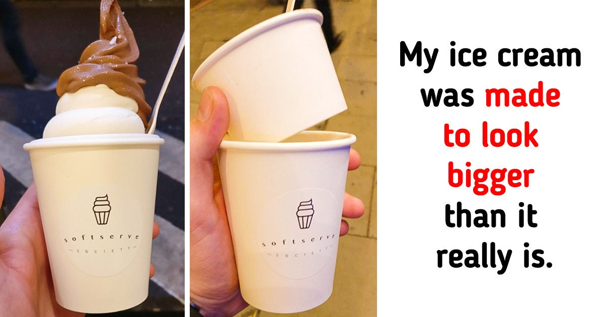
5. “My ice cream was made to look bigger than it really was.”
6. “1001 stickers and 768 of them are useless squares.”
7. That’s one tricky pepperoni window.
8. “This is the biggest letdown I’ve had in a while.”
9. This beef package hides 1/3 of the (missing) steak.
10. “My box of staples was more box than staples...”
11. A couple of stacks of cookies... and 2 half-stacks
12. “These sheep cupcakes”
13. This dry squid container promised to have more!
14. The package seems to be full of cheese!
15. This sticker roll looks big before you unwrap it.
16. This tea came in a pack of 4, facing forward.
17. “My disappointment is immeasurable.”
18. “Not sure what I expected when I saw ’25% off.’”
Have you ever come face to face with any other packaging tricks? Share them with us in the comments below!
