We’ve all been victims to bad design, even if we didn’t realize it. Sometimes it takes multiple times to notice it, if it’s on a public street and more of a decorative issue; but other times it takes us aback immediately because the functionality is compromised. Either way, those who find examples in the wild often expose the situations online.
Now I’ve Seen Everything selected a few designs that made people’s heads spin. Get ready to facepalm!
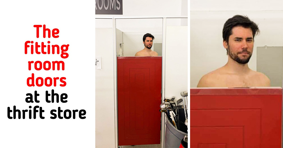
1. “The fitting room doors at the thrift store”
2. “Something’s not quite right.”
3. “My sibling found this at work, and it is near impossible to get the soap on your hand.”
4. It must have been done on purpose.
5. An obvious case of poor design
6. “This toilet at my sister’s house”
7. “See that beige part on the ground? It’s a brand new bike lane.”
8. The 2 best seats in the room
9. “So I just walked into the wrong bathroom...”
10. “The placement of this ‘press to exit button’ in my apartment building”
11. “We may have made a strategic mistake, but this will not deter us.”
12. “I’m no expert but I don’t think penguins have teeth.”
13. “Got that hot fix ready, boss.”
14. “The new lock at my work has the handle placed on top of the keys, making it quite difficult to input the 6+ key code to enter.”
15. “Some poor attempt of a quirky clock”
Can you share equally bad designs and constructions that you’ve seen inside or outside?

